Radix UI
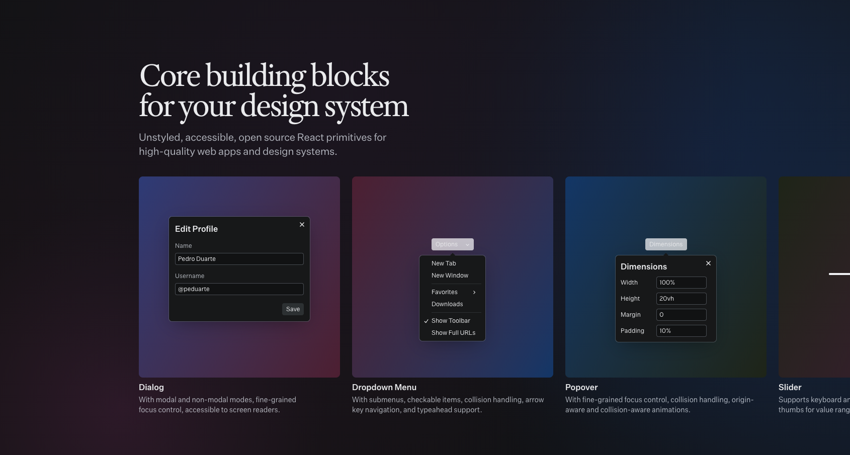
Unstyled, accessible, open source React primitives for high-quality web apps and design systems.
At minimum, we recommend you read the following documentation before you start this integration guide.
Requirements
Introduction
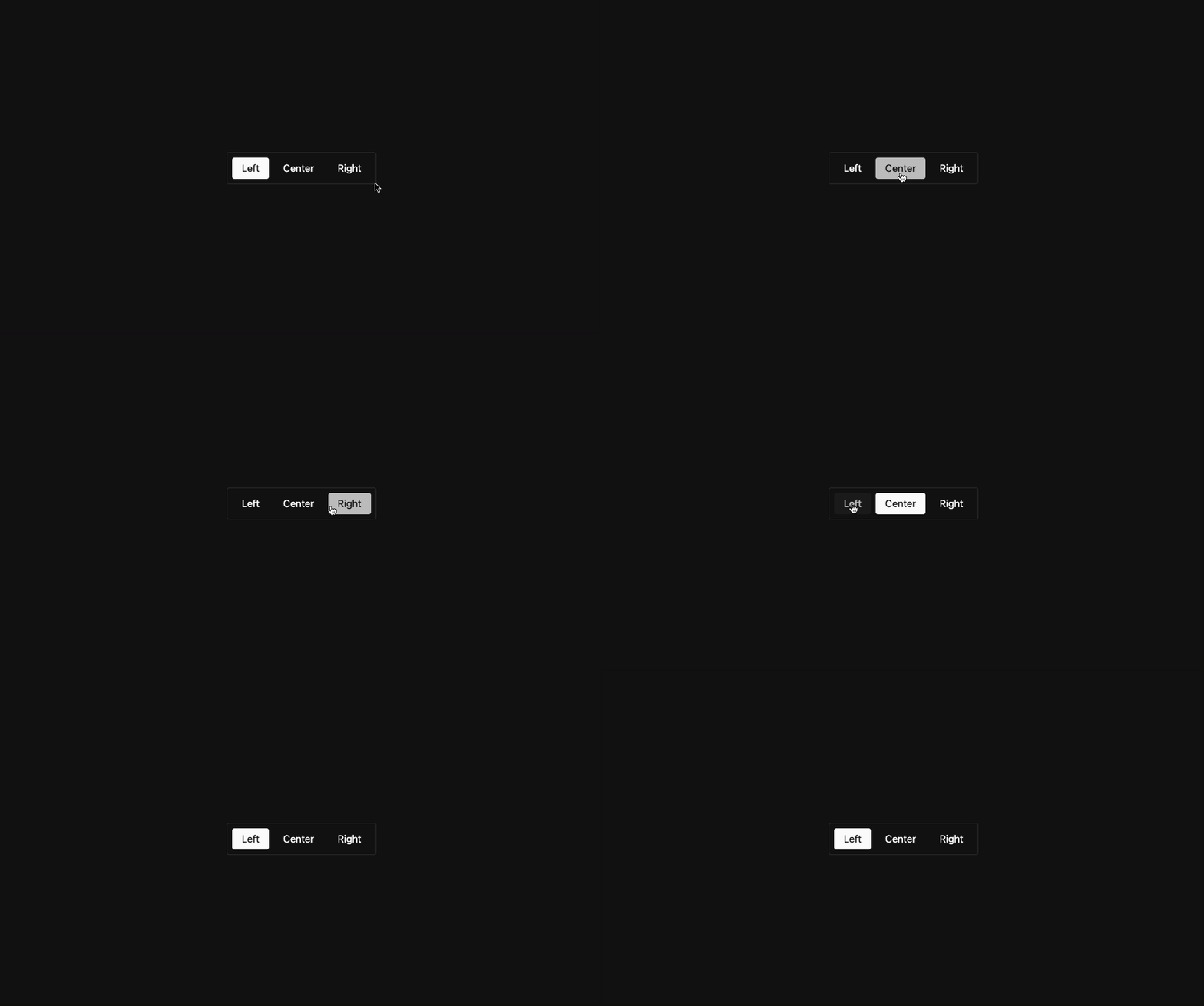
In this guide we'll implement the following Radix UI <ToggleGroup> component. This will showcase the bare minimum requirements for integrating Skeleton with Radix UI.
Get Started
1. Create a Project
To begin, we'll setup a new Vite project with React v19, Skeleton v3, and Tailwind v4.
2. Install Radix Component
Install the Radix UI component package via your package manager of choice.
npm install @radix-ui/react-toggle-group3. Component Boilerplate
Create a new component in /src/components/ToggleGroup/ToggleGroup.tsx and insert the following markup. This will generate an unstyled version of the component. Note that we have renamed the Radix component to RadixToggleGroup to remain semantic and avoid conflict with our own component name.
import { type FC } from 'react';
import * as RadixToggleGroup from '@radix-ui/react-toggle-group';

interface ToggleGroupProps {
	/* ... */
}

export const ToggleGroup: FC<ToggleGroupProps> = () => {
	return (
		<RadixToggleGroup.Root className="ToggleGroup" type="single" defaultValue="center" aria-label="Text alignment">
			<RadixToggleGroup.Item className="ToggleGroupItem" value="left" aria-label="Left aligned">
				Left
			</RadixToggleGroup.Item>
			<RadixToggleGroup.Item className="ToggleGroupItem" value="center" aria-label="Center aligned">
				Center
			</RadixToggleGroup.Item>
			<RadixToggleGroup.Item className="ToggleGroupItem" value="right" aria-label="Right aligned">
				Right
			</RadixToggleGroup.Item>
		</RadixToggleGroup.Root>
	);
};
4. Add the Component
Finally, let's add our new component to the app in /src/App.tsx.
import './App.css';
import { ToggleGroup } from './components/ToggleGroup/ToggleGroup';

function App() {
	return (
		<main className="p-10">
			<ToggleGroup />
		</main>
	);
}

export default App;
Styling
Each Radix UI component accepts a className prop. Use this to provide Tailwind and Skeleton utility classes.
Basic Styles
Styling the <RadixToggleGroup.Root> component.
<RadixToggleGroup.Root
	className="btn-group preset-outlined-surface-200-800 flex-col p-2 md:flex-row"
	type="single"
	defaultValue="center"
	aria-label="Text alignment"
>
	{/* ... */}
</RadixToggleGroup.Root>
Styling each item component. Apply these styles to each button.
<RadixToggleGroup.Item className="btn hover:preset-tonal data-[state=on]:preset-filled" value="..." aria-label="...">
	{/* ... */}
</RadixToggleGroup.Item>
Complete Example
Below is a complete example showing the entire component with all styles and basic configuration.
import * as RadixToggleGroup from '@radix-ui/react-toggle-group';
import { useState, type FC } from 'react';

interface ToggleGroupProps {
	/* ... */
}

export const ToggleGroup: FC<ToggleGroupProps> = () => {
	const [value, setValue] = useState('left');

	return (
		<RadixToggleGroup.Root
			className="btn-group preset-outlined-surface-200-800 flex-col p-2 md:flex-row"
			type="single"
			value={value}
			onValueChange={(value) => {
				if (value) setValue(value);
			}}
			aria-label="Text alignment"
		>
			<RadixToggleGroup.Item className="btn hover:preset-tonal data-[state=on]:preset-filled" value="left" aria-label="Left aligned">
				Left
			</RadixToggleGroup.Item>
			<RadixToggleGroup.Item className="btn hover:preset-tonal data-[state=on]:preset-filled" value="center" aria-label="Center aligned">
				Center
			</RadixToggleGroup.Item>
			<RadixToggleGroup.Item className="btn hover:preset-tonal data-[state=on]:preset-filled" value="right" aria-label="Right aligned">
				Right
			</RadixToggleGroup.Item>
		</RadixToggleGroup.Root>
	);
};
Going Further
If you wish to match Skeleton component conventions, view our contributor component guidelines.
Attribution
Radix UI is created and maintained by WorkOS.